iGEM Wikis - A primer
How to build your team wiki and other useful resources
❓What is the iGEM Wiki?
It is a collection of URLs nested within your team's iGEM page (example: 2020.igem.org/Team:YourTeamName/) that allow you to document your work.
Your iGEM wiki is the face of your iGEM project.
The list of pages hosted on the iGEM server for your team are project deliverables that tick off various medal 🥇🥈🥉 and award 🎖️ criteria.
🌐2020 Wiki Pages
Now let's get down to the details of documenting your iGEM work. As a start, make sure to visit the following link ⬇️
The above link ⬆️ consists of all the pages under your team's name that will be evaluated for medal criteria and special awards!
| ✅ DOs | ❌ DON'Ts |
|---|---|
| Teams must host all content on 2020.igem.org, including: | Teams cannot use: |
| - Fonts 🅰️ | - Adobe Flash |
| - Images 🖼️ | - iFrames |
| - Videos 📷 | - Copyrighted Materials ©️ |
| A team wiki must have Standard Pages for the Judging Form. | Teams cannot edit, disable, hide, or alter the iGEM Login Bar. |
| Teams must make sure to fill all the pages required for evaluation by judges. | Teams cannot alter the wiki after the Wiki Freeze Deadline. |
| Upload files following the format: T--OFFICIAL team name--File_name. | |
| Work on your wiki throughout your iGEM project and only save small edits for last. |
Navigation
Navigating a set of related web-pages on a website requires a hub of links that are present on all the pages in order to get from one place to another without having to know the actual URLs. The most common types of navigation for your iGEM wiki should be:
A Top Navigation Bar
A top navigation bar is the list of links that go to the different pages of your wiki. You may style them with CSS and JavaScript to have drop-down links and provide some cool animations when hovering over the links or while scrolling the page.
Take a look at the following resources to get a basic understanding of the top navigation bar and understand the web design principles behind advanced, more powerful navigation bars for your wiki.
How To Create a Top Navigation Bar
Sticky, Smooth, Active Nav | CSS-Tricks
Side Navigation
This is meant for long web-pages with multiple sections and headers, much like this document. It is useful for the reader to have a static navigation bar on the side of the page that does not change its position while scrolling. Use the following resources to add a side navigation bar for your iGEM wiki.
How To Create a Side Navigation Menu
Footer Menus
A navigation bar cannot cover all your iGEM pages at a single glance. Therefore, it may be useful to build a "sitemap" into the footer of your iGEM webpages. Building a sitemap is easy, considering it stays the same on all your wiki pages. Be sure to also include links to your social media accounts as well as email contacts in your footer.
Images and Diagrams
Images on your wiki provide visual proof of work, and add a certain purpose of style to your web-page. A picture is equivalent to a thousand words, quite literally sometimes. You can replace text heavy documentation on your wiki that often end up being eyesores by adding a few snazzy diagrams and pictures of your experiments. Keep in mind, you might want to also show who your teammates are on the Teams page of your wiki!
Images come in all kinds of different formats, like JPGs, PNGs, SVGs and GIFs.
Check out this link to understand when to use what kind of image!
Links and Images | HTML & CSS Is Hard
Remember that images should also resize based on the width of your device's screen. Simply put, if you specify a LARGE image's absolute width using pixels (px), it may end up being too wide for a smaller device. Make sure to use 💡relative units or percentages to specify your image widths.
A Guide to the Responsive Images Syntax in HTML | CSS-Tricks
Responsive Images | HTML & CSS Is Hard
Typography
Fonts can be downright unpleasing to look at (cough...Comic Sans...cough) or can convey excellent design choices.
Excellent typography for your iGEM wiki is a visual ballad of three to four fonts in the right font sizes.
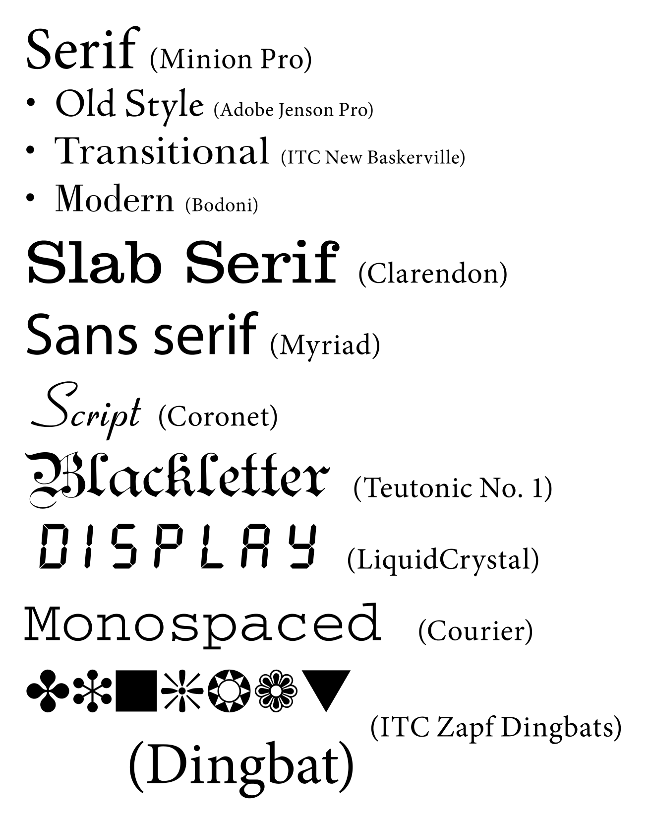
Common font types. Source: Wikipedia
However, choosing the right fonts isn't the end of your typography troubles. The real perils of irregular typography surface when viewing a page on different screen sizes.
To make sense of this caveat, make sure to look at these links that discuss responsive typography as well as typography for different kinds of text on your page.
Web Typography | HTML & CSS Is Hard
Responsive Web Design
If you've gotten this far, you've probably realized your wiki is better off as a responsive set of pages.
It is important to have responsive text and images on your iGEM wiki. What if they are the right size, but don't have proper layouts when you see them? HTML <div> tags typically form the essence of layout classes, and CSS principles play on top. The most common principles you can achieve and invoke using CSS are:
- Flexbox
- Grids
- and most importantly, media queries
Flexbox, Grids and Bootstrap
Flexbox and Grids are two CSS principles that 'contain' elements. They allow these containers to wrap around, move down, move to the side, move up, stay to the right of each other when the device's screen size changes.
To learn more about CSS Flexbox and CSS Grids with excellent, intuitive diagrams, visit the following guides on CSS-Tricks.
A Complete Guide to Flexbox | CSS-Tricks
A Complete Guide to Grid | CSS-Tricks
A powerful framework that provides great starter templates and efficient code for responsive layouts and web design is known as Bootstrap. Take a look!
Media Queries
The third principle of responsive design is governed by media queries. Media queries are part of CSS syntax and they allow for small functions or queries based on your devices' properties.
A typical media query block would be as follows:
@media screen and (max-width: 600px) {
  /* Your code here */
}
Learn more about media queries and other responsive web design techniques down below.
Responsive Design | HTML & CSS Is Hard
Accessibility
Technical issues may arise on certain devices due to various reasons that can cause your content to be displayed improperly. Examples could include your preferred fonts disappearing off the face of your wiki and images going kaput.
To prevent blank spaces in place of failed images and horrid typography replacing your pet font, make sure you have a few fail safe mechanisms in place.
Fallback for Fonts
html {
  font-family: Inter, Helvetica, Sans-Serif;
}
This example snippet ⬆️ shows a list of fallback options for your fonts. The instructions are to display the font family named Inter as the primary option. If that is unavailable for whatever reason, the program defaults to Helvetica. In the absence of that as well, the default Sans-Serif font present on your system that opens in your browser is picked.
Learn more about fallback typography here:
CSS Basics: Fallback Font Stacks for More Robust Web Typography | CSS-Tricks
Fallback for Images
Let's assume you have a high quality picture of your electrophoresis experiment like this:

Source: SASTRA Thanjavur, iGEM 2019
Sometimes, such an image may fail to load and therefore, to still provide information on what the image is, an alt text is written as follows to convey the details of the image in its absence.
<img src="T--YourTeamName--electrophoresis.jpg" alt="Electrophoresis bands for validation of PCR" width="500" height="600">
Learn more about the HTML alt attribute in this article:
Other Resources
W3Schools Online Web Tutorials